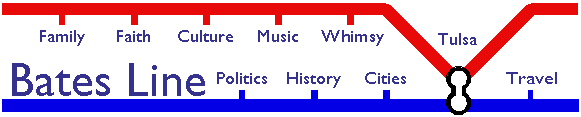
The Governor's Office website has posted the 10 finalists for the design of Oklahoma's entry in the U. S. Mint's series of state quarters. Because the Governor's site doesn't let you look at the 10 designs side-by-side, I've uploaded them below.
| 1 | 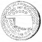 |
2 | 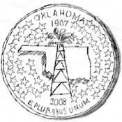 |
3 | 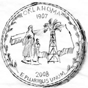 |
| 4 | 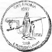 |
5 | 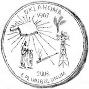 |
6 | 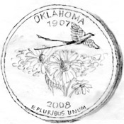 |
| 7 | 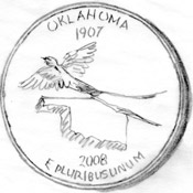 |
8 | 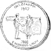 |
9 | 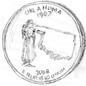 |
| 10 | 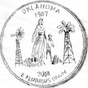 |
To say the sketches are rough is an understatement, but the website says that any design will be refined by the Mint to meet their production requirements.
There are elements of several that I like, but there isn't any one that I like entirely. I guess it's too late to come up with another alternative. I like the state outline, but there's no need to put it at a rakish angle as 3 and 9 do. The 46 stars in 1 and 2 are overkill.
The Pioneer Woman statue works nicely, as does the oil derrick. They aren't simply symbols -- they're also landmarks, something you could come to Oklahoma and see.
(I'm not sure how well a gushing derrick works on a coin. Maybe just a derrick with -- I dunno -- a gigantic roughneck standing next to it, resting his hand on it.)
Our Indian heritage ought to be included, but I'm not sure that the calumet is the best way to symbolize it. The Cherokee star would look very nice on a coin, but that would exclude the other dozens of tribes in the state.
My son likes number 6, and he recognized the Indian paintbrush and scissortail flycatcher, but he thinks it would be even better with the state outline in the background.
A couple of other possibilities -- again, it's probably too late for new ideas -- would be the Osage shield from the state flag, either by itself or over a state outline, or, from our state seal, the farmer and Indian shaking hands in front of an Oklahoma outline. (In the latter case, it would be very appropriate to use Mike of Okiedoke's suggestion for a new state motto.)
You can vote for up to five of the 10 coins and read explanations for each design at the Governor's website.
(Side track: That Flags of the World entry for Oklahoma includes the text of the 1988 legislation which standardized the flag's colors, in terms of the Pantone Matching System. When I ran for City Council in 2002, I used the French Blue of the flag's field, Pantone 285c, for my campaign yard signs.)

Comments (4)
I'm not much of a handwriting analyst, but I'm guessing all 10 designs are the production work of two individuals.
What would make someone draw #9 anyway, except as another derivation of some of the others? Besides, it looks like the indian lady took it in the brains. OTOH, good ol' OK does kind of clug us in the head like that most times.
Of these, #4 & #6 seems the only with any appeal at all to me.
Posted by XonOFF | August 29, 2006 10:36 PM
Posted on August 29, 2006 22:36
Are these the best? How about the state outline in the background and Gene Stipe taking a kickback from a bridge builder?
Posted by Jeff Shaw |
August 30, 2006 8:28 AM
|
August 30, 2006 8:28 AM
Posted on August 30, 2006 08:28
If this is the "best" we can do, then Oklahoma truly is mediocre, just look at the latest entries from Nevada, Colorado and Nebraska, those are coins to be proud of!
Of those shown I like 6 & 8 best
Posted by mad okie |
August 30, 2006 10:36 AM
|
August 30, 2006 10:36 AM
Posted on August 30, 2006 10:36
Sorry to double comment, but looks like the state should have commissioned an artist to do this work. I like 4&6.
Posted by Jeff Shaw |
August 30, 2006 11:34 AM
|
August 30, 2006 11:34 AM
Posted on August 30, 2006 11:34